
Overview
Welcome to the Website Resource Centre!
Thanks for visiting the website resource centre. We're happy you're here!
This resource centre has everything you need to know to help you with building your content, designing webpages and what you need to do to get your content published so our residents have a great experience using our websites.
Here are some the things you will find:
- How to design effective web pages, including how to write content for the web.
- How to edit pages and the GovStack Learning Centre.
- Our governance and approval process for creating new and updating content.
- Resources, FAQs and links to find out more.
- Discussion board so you can get help from your fellow peers.
Goals for our Website
We want our website to be designed based on data and focus on how our residents use our website. Using the principles of good design, we want to transform the way residents interact with our website to get the services and information they are looking for.
- We are committed to making it easier for residents to access the services that are essential to their quality of life.
- Following the principles of good design, we strive to continuously improve our service delivery across all channels, with a specific focus on how we interact and provide services digitally.
- We will transform and modernize the way residents interact with the Region and get the information and service they need. Through integrations with our CRM and other systems, they can submit and track service requests, search for answers, register/ apply for service right from our website.
Governance
Working together to maintain quality
With our website in the GovStack content management system (CMS), and with our QA tool in place, we are establishing an environment where we work in Groups and in a flow. Subject Matter Experts (SME's) can create or edit content in DRAFT, and communications staff can review, edit and publish content in a workflow.
This section addresses:
- Governance and Workflow overview
- New websites and microsites
- The Website Governance Document.
- FAQ for workflow
Governance and Workflow
Workflow is the process to review, approve and publish a page. Workflow will be established in our QA tool to ensure only Communications staff can publish content. In some cases, workflow may extend to the COMS manager level. Corporate Communications will provide spot audits of published content and provide feedback to the Coms Leadership group with a visual scan and through our quality assurance tool.
- Workflow, the process of layering approvals throughout the quality assurance process, is an integral part of our quality assurance process.
- Workflow will be established in the Govstack workflow section.
- Workflow will be established at the SME level, and cascade to communications staff. This will ensure that all aspects of quality, including SEO, search, accessibility and reading level, mobile experience and other aspects of content quality will be consistent and as free from errors as we can make it. This will provide a consistent and high-quality user experience for visitors and clients.
- Workflow will also help identify opportunities to make or add improvements to our site as there is a great “across the org” discussion around our sites generally.
New websites and microsites
New websites must be approved by Corporate Communications. New domains must be registered by ITS. It is recommended that staff work within the GovStack CMS whenever possible. Reach out to Corporate Communications if you are thinking about a new website.
New microsite or Region branded websites or subsites
- Microsites within the GovStack platform: Microsites are small sites within another website configuration. They will have a slimmed down main navigation row like the main site but another ‘row with more navigation specific to the microsite. Microsites are easy to set up and are at no additional cost.
- Websites or Subsites: Websites and subsites within the GovStack platform are the same thing. Websites outside the GovStack platform are not subsites. Websites and subsites incur additional cost to establish and maintain.
- All new Microsites, subsites or external websites must be approved by the Directory of Communications or designate.
- Process for approval:
1) Microsite concepts must be brought to
Corporate Communications for pre-approval (can be approved through the
Communications leadership Group).
2) If approved, review by Corporate Communications is required prior to any public launch or public engagement on the site design. Microsites are subject to the same governance and standards as all other content on the GovStack platform.
- See the Governance DOC for details on the approval process for new sites.
The Website Governance Doc
The Website Governance Draft Doc details the reporting and decision-making roles for the operation of the Region's primarily websites, with additional guidance on protocol for the establishment of new domains, and new websites.
Website Governance will apply to the Region of Waterloo’s corporately branded websites. While primarily applying to websites on the GovStack platform, staff should consider this document as governance generally for public facing digital content.
Ultimate authority for all digital content in the public realm, identified as a Regional site, rests with Corporate Communications as directed by leadership and Council. Websites without regional branding should be coordinated through your respective BRMs.
Access the Website Governance Document in InfoCentre.
FAQ
Workflow
Adding people to workflow
Approvers
What Approvers do and who needs to be one.
Support
Accessing support for the GovStack platform
Editing Pages
Ensuring accessible, consistent language across our site.
In this section you will find what you need for writing page content:
The best place to find information about tools and components in GovStack is through the Govstack Knowledge Base. The following content highlights some basic things you should know as you begin the process of editing pages.
- Header styles must be used in order, you cannot skip a level. e.g. Header 1, Header 2, Header 3.
- Limit the use of bold and italics in page content, it can be difficult for some users to differentiate.
- Underline should only be used for hyperlinks.
- Avoid using superscript or subscript as it changes line height and can also be difficult for some users to discern.
- Avoid use of symbols in text.
- Keep tables simple without merged or split cells as this will limit accessibility. Ensure your header rows are labelled in cell properties and header properties.
- For cloned pages where you want to change a name, rename the outbound link not the home page.
- For image resizing in a content page, don't drag the corners. The image may appear large when you import it, but it will automatically resize to browser width. If you use the image property settings you can adjust how it looks.
- It is best practice to give your media (i.e. images, files) meaningful names so you can more easily find them.
Your accessibility training is your guide to effective website content development. See the writing quick links to the right for details. If you have not received accessibility training for website content, reach out to CORP COMS and let them know. Rely on this guide and your peers, who will have had training and can help.
Content should be user centric. Content that is central to the user is content written in plain language at the grade level most appropriate to your group, but always clear and understandable. Think of your user group (your primary audience) and design/write for them. Landing pages are helpful in finding services or information about services. Here are some quick links and tips on creating great content:
- Learn more about writing best practices from the GovStack learning centre. These are great resources to keep you on track when writing content.
- Your quality assurance tool will provide metrics on the accessibility of your pages. This tool should be an integral part of your content creation process. Pages with basic errors will flag for remediation. For plain language, refer to the deck produced by Mandie Malott at Fiddleleaf accessibility.
- You can quickly check readability statistics using MS Word.
- Avoiding the unnecessary. It is important to prioritize your content when drafting with the most important information close to the top. How will you control “bloat” in your content? Content and information are important to have until it's in the way of a good user experience. Too much information or repetitive items can make it hard for people to find what they are looking for. It can also create barriers to accessibility as people struggle to find relevant information.
- Content may have an “updated on xx date” tag on the page at the top to help users understand content ‘freshness.’ However, content that is out of date needs to be removed or updated. How are you managing content timeliness? Published pages need to be tracked and monitored, updated and unpublished as necessary.
In most cases, using the active voice will help your audience understand what they’re reading. Sentences in the active voice are direct, clear and easier to understand. Their structure is logical and easy to follow because the subject is the doer of the action: subject (the doer) + verb (the action) + object (who/what the action is about)
In a passive sentence, it may not be clear who or what is doing the action. This makes the sentence harder to understand. The structure of a passive sentence is:
Object + verb + subject
Examples of active and passive voice:
Write: We may ask you to provide proof of citizenship. (active)
Instead of: You may be asked to provide proof of citizenship. (passive)
Write: You must file your returns electronically. (active)
Instead of: Your returns must be filed electronically. (passive)
The passive voice is useful in some cases. For more on this topic, consult:
- IMPORTANT: you must have copyrights to use any image on any Regional website! If you are not sure if you have the right to use an image, talk to Corporate Communications or Creative Multimedia Services (CMS) or do not use the image.
- The Region’s Creative Media Services has a repository called AssetBank of pre-approved images for use and can also source new images with rights for you if you need them.
- Stock photography is usually not suitable for our sites. Use original photography. CMS can help coordinate this for you.
One of the first things you will want to do when establishing a page is to ensure you are primed for search. Ensure your page descriptions and metadata sections are complete.
SEO refers to characteristics of your page that help it to be found by search engines. If we are consistent, this can greatly improve the user experience for search:
- Add Metadata. Under the SEO tab, add a page title and description to improve SEO.
- Add headings to broadcast topics clearly on the page.
- Headings are mandatory if there is text content on the page. Headings are part of accessibility standards and contribute to SEO. Headings can also be used in a table of contents (TOC) if your page has multiple headings on the page. TOC anchored to headings in the page contributes to a good user focused design, and is particularly helpful to users on mobile.
- Anchors are bookmarks that allow you to link to specific parts of a page's content.
- You can create anchor links to text, components, and accordions. For detailed information on each option visit Govstack's article on Anchors.
- Add image alt tags or alt tags for tables which are useful for SEO and required for accessibility!
- Add keywords in the metadata and (potentially) in your page content. Keywords should be placed with the first 100 words on a page.
- Avoid special characters (e.g., ?, &, =, +, %, etc.). Using letters, numbers and hyphens are best.
- 1.1 Help people complete tasks
- 1.2 Consider the needs of the audience
- 1.3 Provide equivalent content in both official languages
See the quick links to the right for additional writing resources.
UX Design
User Experience (UX) and User Interface (UI) Design
In this section, you will find best practices and guidelines for designing home pages, landing pages, and interior pages to help our end users get what they want to get done quickly and easily while providing a consistent, accessible and intuitive experience across our website.
On this page:
Refer to this section for guidelines to design and update your interior pages. Remember that we want end-users to find what they need easily and complete what they need to do quickly, all while laying out things in a way that is pleasing to look at.
Page Width
- All interior pages should have the side nav menu on the right hand side. Only in extreme situations, should these pages be full width!

Banner Images
- Avoid putting banner images on interior pages (as this takes up valuable space before users get to the important content) unless the interior page is meant to be more of a marketing page or the banner image is informative.
Page Titles
- Use clear and succinct page titles that describes what the page is intended for.
Table of Contents
- Use table of contents when an interior page has four or more headings and lengthy text.
- Ensure it goes right under the title header of the page. If you do have a few sentences before the table of contents, include a horizontal line after the text to separate out the table of contents.
- Include a horizontal line after the table of contents. You may include the horizontal line within the beginning of the next module to avoid excessive spacing.
- Within the table of contents, list only headers and do not include sub-headers as you don't want the table of contents to be a long list but rather to help users get straight to the content they need.

- To create a table of contents, you will need to create Anchor Links on your page. Review Govstack's article on Anchor Links to learn more.
Headers
- Add headers to each component of the interior page using logical structure (i.e., H1, H2, H3). This ensures users using screen readers can navigate the page.
Typography
- Having a standardized typeface that works well on different viewing platforms, has a range of weights available and provides a high degree of readability and legibility is a primary design element that strongly ties different experiences across different websites together.
- Choose Roboto for main/body text.
Written Language
- Refer to the section on 'Active Voice' under 'Editing Pages' as well as the Canadian Style Guide for writing style.
Links
- Ensure the link opens in a new tab if you are linking to:
- a page on a different website
- a PDF
- a form that is not embedded on the website (e.g., external forms, forms on Verint)

- Ensure the link does not open in a new tab if you are linking to:
- a page within the website
- a form embedded on the website

- Instead of writing out URLs, use meaningful and concise descriptive text and avoid embedding instructions (e.g., "click here") inside link text.
- Label each link with meaningful and concise text that will describe where the user is going (e.g., Launch form to report vaccinations).
Colours
- For UI elements, having a standardized colour palette, especially where users need to take an action (e.g., "submit", "cancel", etc.) simplifies the recognition/recall aspect of engaging with different web properties.
- For buttons, choose a blue background with white text or icons.
- For design colours, choose Region blue branding across all Region websites.
Best Practices
Like a homepage, landing pages help users get what they need to get done quickly and easily. However, landing pages act as a standalone, specific page that is designed with a single, focused goal, such as accessing services for children and youth or services and information about garbage collection. Here are top tips for designing effective landing pages:
- Keep it simple - use clean designs to avoid overwhelming users by removing navigation menus and other distracting links to keep the focus on why they are there in the first place.
- Place important elements "above the fold" - ensure primary calls to action (CTAs) and the purpose of the page are visible without scrolling.
- Use white space effectively - using white space improves readability and draws attention to the most important elements, such as the purpose of the page and CTAs.
- Write a compelling purpose of the page, or headline - ensure the headline is clear, concise and it lets the user know why the are on the page and what they can do to reach their goal.
- Use action-oriented CTAs - strong, clear language helps the user to take action on what they came to do, such as "Apply for Housing," "Report your Vaccines," or "Find the Garbage Schedule."
- Use directional cues - direct the user's eye toward the CTA using visual cues such as arrows or contrasting colours.
For more information on how to create a landing page, please see this resource from GovStack: Create a Landing Page
Page Width
- All landing pages should have the side nav menu on the right hand side. Only in extreme situations, should these pages be full width!
Banner Images
- For the Region of Waterloo website, put interior banner images on all landing pages.
- Use images without text in banners and put heading text where headers should go underneath the banner. See the below screenshot where the heading, Culture and Experiences is located.

Page Titles
- Use clear and succinct page titles that describes what the page is intended for.
Headers
- Add headers to each component of the landing page using logical structure (i.e., H1, H2, H3). This ensures users using screen readers can navigate the page.
Action Items
- Through user testing, we have identified what patterns users liked and were most comfortable with, as well as the position of action items on both the homepage and landing pages. We should aim for main action items to be in a similar location and style across all Region websites.
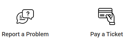
- Use icons for quick links, actions, and top tasks.
- Use icons only on the homepage and landing pages.
- Choose icons within the 'Media' section in Govstack. Once you've opened 'Media', you will need to find the folder titled, 'Black Icons' as seen in the below screenshot:
- Choose the same icon for the same actions across all websites (e.g., 'Report a problem', 'Pay', 'Jobs', 'Register', etc.).
- If you can't find an icon in the Media folder, connect with Jenny Walker (jewalker@regionofwaterloo.ca) or Martha Ta (tmartha@regionofwaterloo.ca) for help to find an icon or try looking in these sites:
- If you have found an icon on external sites and want to upload it, follow the steps in this step by step guide or reach out to Carl Nattrass (CNattrass@regionofwaterloo.ca).
- Choose the default setting of a black outline with a white background.
- Specific branded icons (e.g., Rick Hansen certification) may be approved for usage.
- Choose the call to action with an image block for information campaigns. This is NOT to be used interchangeably with icons for quick links.

Typography
- Having a standardized typeface that works well on different viewing platforms, has a range of weights available and provides a high degree of readability and legibility is a primary design element that strongly ties different experiences across different websites together.
- Choose Roboto for main/body text.
Visual Language
- Writing in a consistent "tone" for visual images maintains a consistent message and connection for users. Even though we have different audiences across our websites seeking different information, this visual tone of the images should remain consistent.
- For action icons, start with verbs (e.g., Pay for a Ticket, Apply for MobilityPLUS, Request an Item).
- For icons taking you to content, use the name of the page (e.g., "Constructions and Road Closures").
- Keep wording between two to three words, where possible. In some cases this may not be possible due to the name of the service (e.g., Apply for Ontario Works) and that makes sense.
Written Language
- Refer to the section on 'Active Voice' under 'Editing Pages' as well as the Canadian Style Guide for writing style.
Links
- If you are linking to a page within the website, ensure the link does not open in a new tab.
- If you are linking to a PDF or a different website, ensure the link opens in a new tab.
- Instead of writing out URLs, use meaningful and concise descriptive text and avoid embedding instructions (e.g., "click here") inside link text.
- Label each link with meaningful and concise text that will describe where the user is going (e.g., Launch form to report vaccinations).
Colours
- For UI elements, having a standardized colour palette, especially where users need to take an action (e.g., "submit", "cancel", etc.) simplifies the recognition/recall aspect of engaging with different web properties.
- For buttons, choose a blue background with white text or icons.
- For design colours, choose Region blue branding across all Region websites.
Our homepage is the most important page of our website. It is the first chance to engage and captivate our residents. An effective homepage guides residents in a clear way to achieving their goal - why they came to our website in the first place. Here are top tips for designing an effective homepage:
- Prioritize user needs - identify the most common reasons users visit the website and ensure they can find what they need quickly and easily.
- Clear navigation - an organized menu bar with 4-6 primary options helps to guide users to the website's main sections and keeps it simple without overwhelming the user.
- Prominent search - search tends to be the most popular way for users to navigate a website, so it's important they have a way to go directly to the content they are looking for.
- Calls to Action (CTAs) - these guide users to the most viewed pages directly from the home page without needing to use search or navigate the menu, which helps to reduce clicks and create a better experience.
- Prioritize key services - ensure key services and information is at the top or near the top of the homepage so users don't have to scroll to find what they are looking for. Remember, this can change based on seasonal demand, which allows us to be more responsive to the needs or our residents.
For more information, please see this blog post from GovStack: Municipal Homepage Design Best Practices.
Headers
- Add headers to each component of the homepage using logical structure (i.e., H1, H2, H3). This ensures users using screen readers can navigate the page.
Action Items
- Through user testing, we have identified what patterns users liked and were most comfortable with, as well as the position of action items on both the homepage and landing pages. We should aim for main action items to be in a similar location and style across all Region websites.
- Use icons for quick links, actions, and top tasks.
- Use icons only on the homepage and landing pages.
- Choose icons within the 'Media' section in Govstack. Once you've opened 'Media', you will need to find the folder titled, 'Black Icons' as seen in the below screenshot:
- Choose the same icon for the same actions across all websites (e.g., 'Report a problem', 'Pay', 'Jobs', 'Register', etc.).
- If you can't find an icon that fits in the Media folder, try looking in these sites:
- If you have found an icon on external sites and want to upload it, follow the steps in this step by step guide or reach out to Carl Nattrass (CNattrass@regionofwaterloo.ca).
- Choose the default setting of a black outline with a white background.
- Specific branded icons (e.g., Rick Hansen certification) may be approved for usage.
- Choose the call to action with an image block for information campaigns. This is NOT to be used interchangeably with icons for quick links.
Typography
- Having a standardized typeface that works well on different viewing platforms, has a range of weights available and provides a high degree of readability and legibility is a primary design element that strongly ties different experiences across different websites together.
- Choose Roboto for main/body text.
Visual Language
- Writing in a consistent "tone" for visual images maintains a consistent message and connection for users. Even though we have different audiences across our websites seeking different information, this visual tone of the images should remain consistent.
- For action icons, start with verbs (e.g., Pay for a Ticket, Apply for MobilityPLUS, Request an Item).
- For icons taking you to content, use the name of the page (e.g., "Constructions and Road Closures").
- Keep wording between two to three words, where possible. In some cases this may not be possible due to the name of the service (e.g., Apply for Ontario Works) and that makes sense.
Written Language
- Refer to the section on 'Active Voice' under 'Editing Pages' as well as the Canadian Style Guide for writing style.
Links
- If you are linking to a page within the website, ensure the link does not open in a new tab.
- If you are linking to a PDF or a different website, ensure the link opens in a new tab.
- Instead of writing out URLs, use meaningful and concise descriptive text and avoid embedding instructions (e.g., "click here") inside link text.
- Label each link with meaningful and concise text that will describe where the user is going (e.g., Launch form to report vaccinations).
Colours
- For UI elements, having a standardized colour palette, especially where users need to take an action (e.g., "submit", "cancel", etc.) simplifies the recognition/recall aspect of engaging with different web properties.
- For buttons, choose a blue background with white text or icons.
- For design colours, choose Region blue branding across all Region websites.

Colours
- For 'banner Alerts', which are displayed at the top of the page:
- Choose:
- Red - for major incident
- Green - for info
- Yellow - for caution
- Do not choose blue.
- Choose:
- 'Pop-up Alerts', which appear in the middle of the screen are only to be used by Corporate Communications.
- For links:
- Choose blue for links on the main navigation.
- Choose black for the links on sub-navigation and light grey for link hover.
- Choose blue for links on the main navigation.
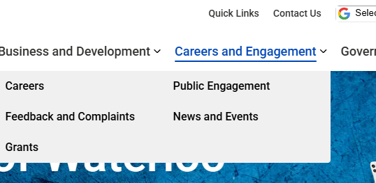
Navigation Menus and Footers
- We want to choose a common functionality and placement and position of the navigation menus to deliver a consistent experience for users across all our Region websites.
- For the top navigation menu:
- Stack Google Translate and search bar above the main verticals/first level headings.
- For footers in subsites:
- Place the Region logo on the left hand side.
- Use the columns, 'Contact Us', 'Resources', and 'Connect With Us' in this order.
- Add more elements as needed but have no more than four columns.
- The aim is to keep it simple and not busy!
Term | Definition |
User Experience (UX) design | The process of creating products or services that provide meaningful and relevant experiences for users. |
User Interface (UI) design | The process designers use to build interfaces in software or computerized devices, focusing on looks or style. |
Digital Experience
Designing for a Good Digital Experience
On this tab, you will find best practices and recommendations for designing a good digital service experience, including how to design a digital form. The Principles of Good Service Design can be applied to all types of services, whether they are online, over the phone or in-person. Think about the user journey to understand how users are interacting with your digital service and what you can do to apply the principles and best practices to make for a good experience.
- Design for mobile-first. Design your forms for small screens and mobile-first. Ensure you are checking on a variety of screen sizes and adjust as needed.
- Explain the purpose and expectations. At the beginning of the form, explain the form's purpose, instructions and what the user can expect.
- For example, "Please complete this form to apply for this Service. You will be asked a series of questions and to provide information to apply for this Service. We are collecting this information from to determine if you are eligible for the Service. If you need an alternate format or help with filling out this form, please contact the Region at 519-575-4400. We will contact you within 10 business days to let you know if you are eligible for the Service."
- Single column. Use a single column layout so the user can easily scan and it is compatible with mobile screens.
- Sizing. Adjust the input field size so it matches the length of the answer expected from the user.
- Plain language. Use simple, clear language and instructions upfront and throughout the form to guide the user. Tell users what they need know and when they need to know it.
- Keep it short. Only ask for essential data that is needed to complete the service and clearly mark mandatory fields. Put background and context information on a content page on the website.
- Grouping fields. Group related fields together, such as name, address and email. Start with easy fields and move to more complex questions.
- Default and autofill responses. Use default or autofill responses and closed-ended questions (e.g. radio buttons, checkboxes) wherever possible and when it makes sense. This allows the user to fill out the form quickly and improves accessibility.
- Inline validation. Where possible, validate input as the user is typing (e.g. email address) and use example text in the box so the user knows the format.
- Progress indicators. Use progress indicators for multi-page forms so users know how far along they are in the process.
- Use page breaks for conditional questions. If you are setting up your question so that it appears based on a response to a previous question (i.e., skip logic), use a page break to separate the questions. Do not make the conditional question appear dynamically as this impacts the experience for a user using a screen reader.
- Try it yourself! Review the form for any functional issues before launching. Would someone using a keyboard be able to complete the form?


Here is a sample digital form that shows examples of the best practices. Please note that different platforms will have varying capabilities, so you may not be able to apply all of the best practices as suggested. We encourage you to do your best!
Glossary
Glossary
|
Term |
Definition |
|
Governance |
The governing structure by which we create and maintain quality control. |
|
Workflow |
The process to approve new content for the website. |
|
Metadata |
Additional information included with your page content that help seach engines find your page. Meta data contributes to “Search engine optimization” (SEO). |
|
Digital transformation |
A catch all term the Region is using to indicate our desire and efforts to improve digital services to drive efficiencies in service delivery. |
|
User experience |
The term commonly used to describe the experience of the user on our website. Thinking in terms of the user experience helps shift focus from “our needs” or the needs of the program to the client’s needs when designing content. |
|
Canadian Style Guide |
Created by the Federal Government, the Canadian Style guide is a set of writing principles and techniques that help make web content clear and adapted to the needs of all people. |
Reference
- MSWord’s Readability Checker.
- Canada.ca Content Style Guide - Canada.ca
- GovStack Learning Centre
- CP style Cheat Sheet.
- Governance Doc.
- Webinar Training | Govstack: Training videos that take you through each element of the GovStack environment. These videos are very detailed and somewhat long.
- Govstack Content Management System - Learning Centre: The main landing page for the GovStack CMS in the GHD Leading Centre.
- Writing Best Practices | Govstack: Please review writing best practices when drafting content
- Slides from Accessibility training with Fiddleleaf (day one)
- Slides from Accessibility training with Fiddleleaf (day two)
- Sitemap XML | Govstack: Page ranking is to be set by corporate communications!


